Stratification is a quality control tool for sorting data, things, and people into separate and distinct categories. Stratifying your data can help you figure out what it means, revealing patterns that might otherwise be undetectable when it’s grouped together.
Stratification is one of the 7 QC tools. Following are the other 7 QC Tools
Table of Contents
How is stratification used in QC Tools?
Stratification can be used in several different quality control tools, including:
- Pareto chart: to sort defects by type or severity
- Histogram: to group and compare data by intervals
- Box plot: to identify and compare the distribution of data sets
- Scatterplot: to examine the relationship between two variables
How does Stratification work?
To stratify data, you will need:
– A list of items to be stratified
– A way to categorize the items (e.g. by type, by severity, by interval)
– A way to record the data (e.g. in a spreadsheet)
Once you have these things, you can begin stratifying your data. To do this, simply sort the items into different categories.
For example, if you were stratifying data on car accidents, you might sort them by type of accident (e.g., head-on collision, rear-end collision, sideswipe), by severity (e.g., fatal, serious injury minor injury), or by location (e.g., urban, suburban, rural).
Once you have stratified the data, you can then begin to analyze it. This will allow you to see patterns in the data, and potentially identify problems that can be addressed.
For example, if you stratify car accidents by type, you might find that most accidents are due to rear-end collisions.
This could indicate a problem with the design of the car, or with the way that people are driving. By identifying these problems, you can take steps to fix them and reduce the number of accidents.
Example of Stratification
For example, imagine you’re a manufacturing company that produces widgets. You want to know how many defective widgets are produced per day. You could collect all of the data on defective widgets and calculate the average number of defects per day. However, this would lump together all types of defects, and you wouldn’t be able to see patterns in the data.
Instead, you could stratify the data by type of defect. This would allow you to see how many widgets are defective due to each type of problem. You might find that most defects are due to a single type of problem, such as a loose screw. By identifying this problem, you can take steps to fix it and reduce the number of defective widgets.
Another example of stratified data would be if you were a company that makes cars. You could stratify the data by type of car (e.g. sedan, SUV, sports car), by color, engine size, etc. This would allow you to see how many of each type of car you produce, as well as compare the production of different types of cars.
How to stratify data using Excel
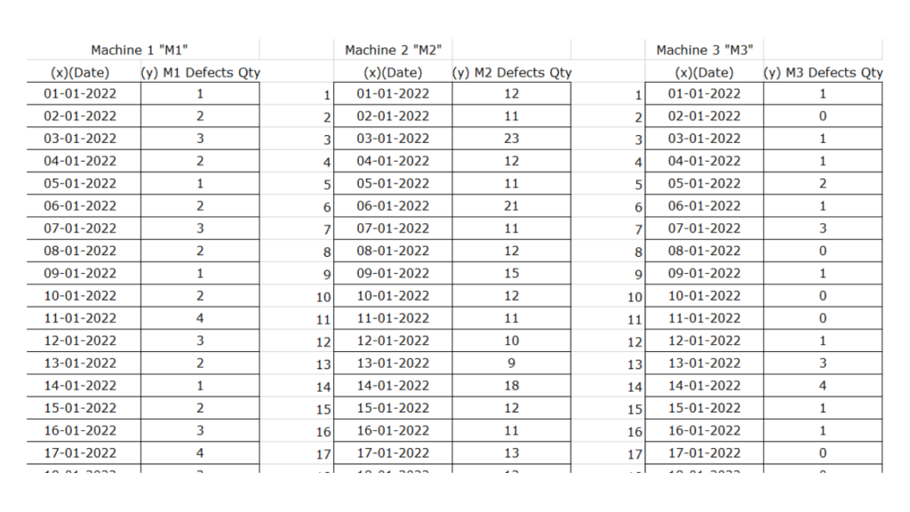
There are several ways to stratify data, but the most common method is to use a table or spreadsheet. To stratify data using a table, first create columns for each category you want to track. Then, add rows for each data point.

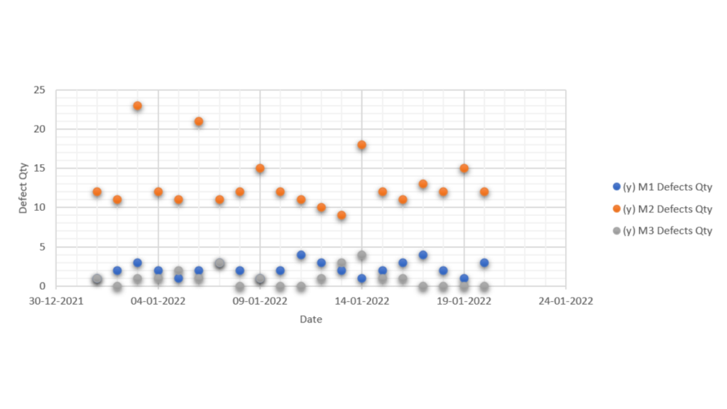
Once you have your data stratified, you can use see pattern in the data.
For example, for this problem you would see majority of defects are generated on Machine no. 2.

Hence we need to look closer at the functioning and condition of Machine No. 2.And rectify problems in that machine to reduce rejection.
Template for stratification
Below is a template you can use to stratify data using a table or spreadsheet. Simply create columns for each category you want to track and add rows for each data point.
Flow chart vs Stratification
Some lists of 7 QC tools use flow charts instead of Stratification. However, Flow charts and Stratification are two different tools that are used in Quality Control.
The flow chart is used to visualize the sequence of steps in a process, event, workflow, system, etc. while Stratification is used to create categories (or strata) for the purpose of analyzing data.
That being said flow chart is also a very powerful tool and is a great tool to have in your tool kit.
Since many folks consider flow charts to be one of the 7 QC tools, it is better to cover it in length here.
What are Flow Charts?
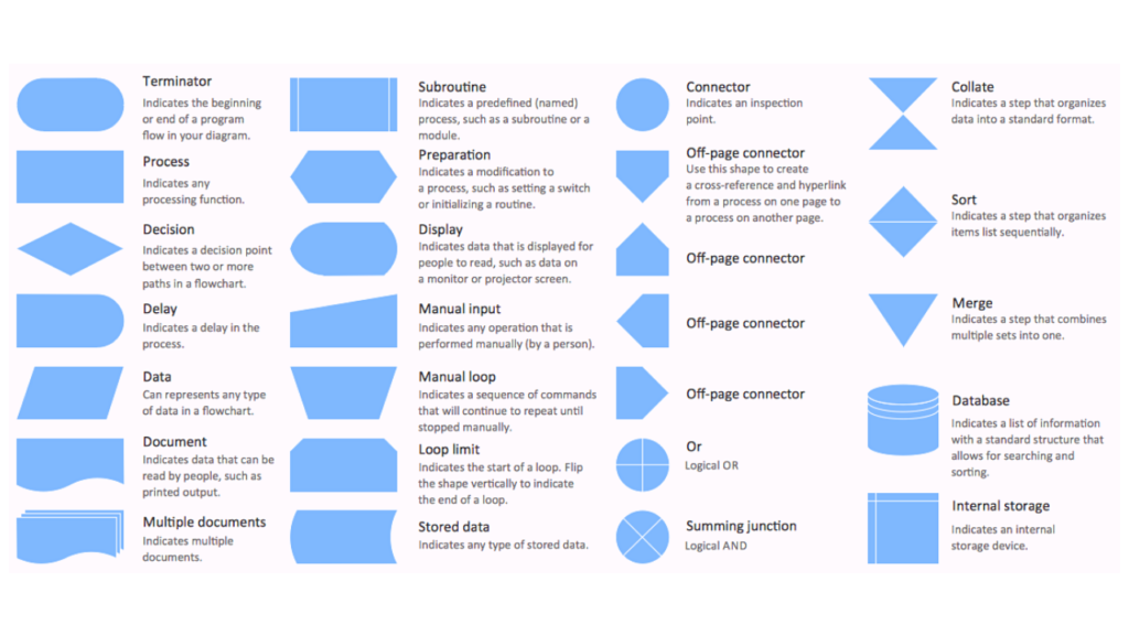
Flow charts are a graphical representation of a process or algorithm. They use special symbols to represent different steps in the process and the relationships between them. Flow charts are used to visualize and improve processes, as well as to document and communicate them.
Flow charts use a standard set of symbols, and it’s important to standardize the use of these symbols so anyone can understand and use them easily. Here’s a roundup of all the key flowchart symbols.

Types of flow charts
There are three main types of flow charts:
- Macro flow Charts
- MicroFlow Charts
- Process Flow Charts
Macro flow charts show the high-level process as a whole. Macro flow charts are used when you want to get an overview of the entire process, and they typically use symbols that are more generic in nature.
Micro flow charts zoom in on a specific step within the process. Micro flow charts are used when you want to focus on a specific step within the process, and they typically use symbols that are more specific in nature.
Process flow charts show the steps involved in a specific process. Process flow charts are used when you want to document the steps involved in a specific process.
Where do we use flow charts?
Flow charts are used in many different industries and across many different processes. Here are some examples of how flow charts are used:
- In manufacturing, to document the process of how a product is made
- In business, to document the sales process or workflow
- In software development, to document the design of a software system
- In healthcare, to document patient care processes
- In teaching, to help students learn new concepts
How to make Flow Charts?
There are a number of ways to make a flow chart. The most common way is to use a software package or online tool, but you can also create your own flow charts using a word processing program or drawing tool.
Making Flow chart in MS Word
The following steps will show you how to make a flow chart in Microsoft Word:
1. Open a new document in Microsoft Word.
2. Click on the Insert tab and then select the Shapes button.
3. Select the Oval shape and draw it on the page.
4. Right-click on the oval and select Format Shape.
5. Select the Line button and set the Weight to Thick. Draw a line from one end of the oval to the other.
6. Repeat steps 4-5 for the other shapes you want to include in your flow chart.
7. When you’re done, click on the File tab and select Save As.
8. In the Save As dialog box, select PDF as the file type and click Save.
Making Flow chart in Adobe Illustrator
The following steps will show you how to make a flow chart in Adobe Illustrator:
1. Open Adobe Illustrator and create a new document.
2. Click on the File menu and select Place.
3. Select the file containing the shapes you want to use in your flow chart.
4. Click on the shape you want to add and drag it into the document.
5. Repeat steps 3-4 for all of the shapes you want to include in your flow chart.
6. When you’re done, click on the File menu and select Save.
7. In the Save As dialog box, select PDF as the file type and click Save.
Online tools for making flow charts
There are also a number of online tools that you can use to make flow charts. Here are some examples:
- Gliffy: https://www.gliffy.com/
- Lucidchart: https://www.lucidchart.com/
- Google Drawings: https://drawings.google.com/
- Visme: https://visme.co/
Tips to Use flow charts
Once you have created your flow chart, you will need to know how to use it effectively. Here are some tips:
- Read the flow chart from top to bottom and left to right.
- Pay attention to the lines connecting the shapes. These lines indicate the sequence of steps in the process.
- The shapes at the beginning and end of the flow chart represent the start and end of the process.
- If you need to, you can add notes to your flow chart by using text boxes.
- You can also use color and shading to highlight different parts of the flow chart.
Flow charts and stratification are a valuable tool for improving processes, as well as for documenting and communicating them.
By following the details above, you can ensure that you use flow charts and stratification in an effective and efficient manner.


