A Pareto chart is a graphical tool used to display the relative proportions of occurrence of different values. It is named after economist Vilfredo Pareto, who observed that 80% of Italy’s land was owned by 20% of its population.
The Pareto principle, also known as the 80/20 rule, has been popularized in business and quality management as a way to focus on those activities that will yield the most results. The theory behind the principle is that a relatively small number of causes (the vital few) produce the majority of effects (the trivial many).
In other words, you can achieve a lot with a little effort if you focus on the right things. When applied to quality improvement, the Pareto principle can help you prioritize actions and allocate resources to achieve the greatest impact.
The bars are arranged with the longest on the left and the shortest on the right so they visually depict what percentage occurs more often than others. A Pareto chart can be used to find what factors are more important so that you can focus on them.
The Pareto Chart is one of the 7 QC tools. Following are the other 7 QC Tools
- Checksheet
- Fishbone Diagram
- Scatter Diagram
- Histogram
- Stratification
- Control Charts
Table of Contents
What is the Pareto Chart used for?
The Pareto chart is used for
- To find and illustrate the significant causes of a problem.
- It is often used as part of the problem-solving process to help identity which problems need to be solved first. The 80/20 rule, which states that 80% of the effects come from 20% of the causes, is often applied when using a Pareto chart.
In short Pareto chart is a prioritization tool, that can be used to prioritize our energy expenses.
When to use a Pareto Chart?
Ask yourself two questions.
- Can you arrage data into categories?
- Is the rank of each category important?
If the answer is “yes” to both these questions, you can use Pareto charts.
Pareto Chart and Six Sigma
A Pareto chart is a powerful tool that can be used in Six Sigma to help identify the most important areas to focus on.
When using a Pareto chart in Six Sigma, it is important to remember that the goal is to find the most common causes of a problem. The chart can be used to identify the areas that should be focused on to achieve the biggest results.
A Pareto chart can be used for project selection in the “define” phase of DMAIC.
Suppose You’re trying to decide which six sigma project to work on, but there are just too many options.
With so many potential projects to choose from, it can be hard to know where to start. How do you know which one will have the biggest impact?
Use a Pareto chart to help you prioritize the projects. The chart can be used to identify the most common causes of a problem, and then you can focus your efforts on those areas. This will help you get the biggest results in the shortest amount of time.
A great alternative for project selection can be Cause and Effect Matrix.
The Pareto chart can also be used to identify the most important tasks that need to be completed in order to achieve the desired results in a project. The chart can also help leadership teams focus on the most important areas of a project and make sure that these areas are given the attention they need.
The Pareto chart is just one tool that can be used in Six Sigma. It is important to use a variety of tools to get a complete picture of the problem. When used correctly, the Pareto chart can help teams focus on the most important areas and achieve better results.
Role of Pareto Chart in Root cause analysis and Quality Control
Quality control is an important part of any business. Without quality control, products can be defective and customers can be unhappy.
A Pareto chart is a tool that can be used in quality control to help identify the most common causes of problems. The chart can be used to find the areas that need the most attention in order to improve quality.
By using a Pareto chart, businesses can focus on the most important areas and make sure that these areas are given the attention they need. This will help to improve quality and avoid potential problems.
Suppose you are a business owner who is interested in using a Pareto chart for quality control. You have gathered data on the number of customer complaints that your business has received over the past month.
You can use a Pareto chart to help you find the most common reasons for complaints. The chart can be used to find the areas that need the most attention in order to improve quality.
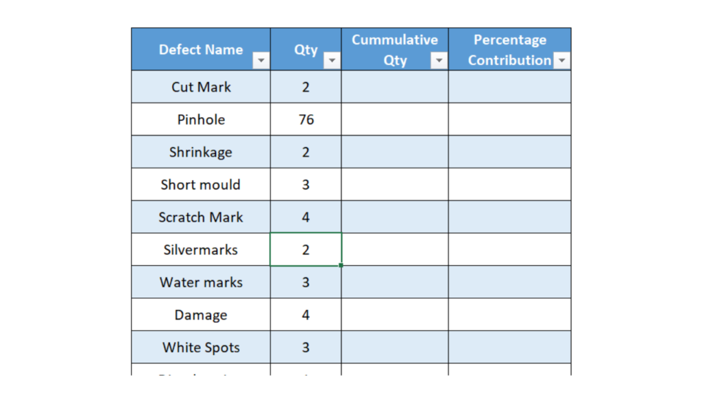
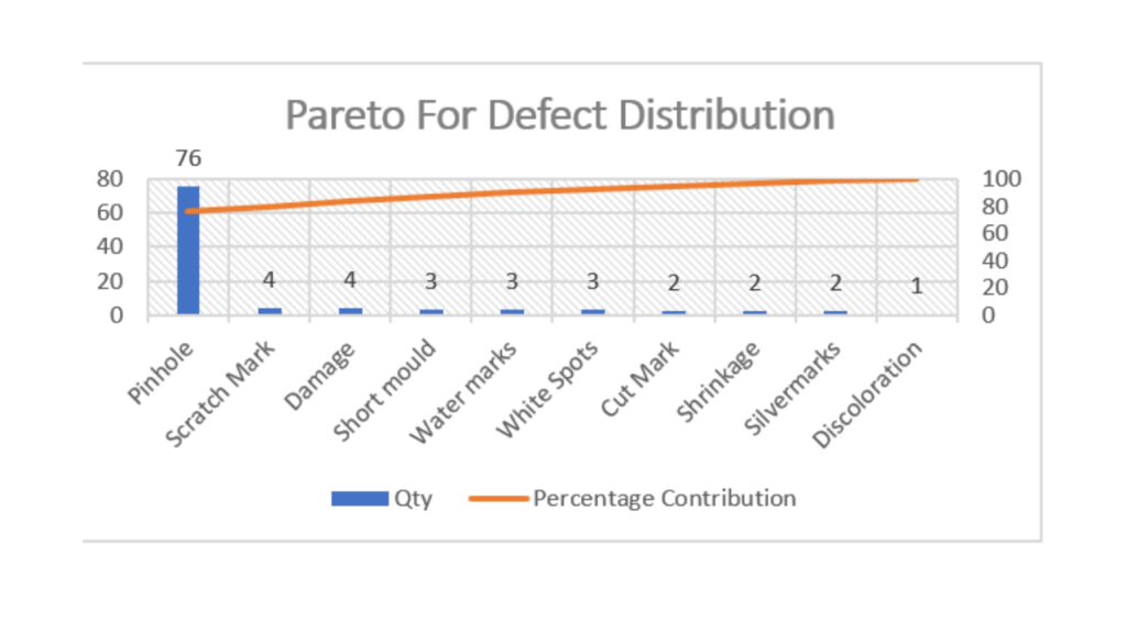
Let us take a specific example, suppose you are a tire company and you find that there was a total of 100 complaints in last one year. The distribution of defects is shown in the table below.
If you sort the data on Pareto, you will find that the majority of the complaints are due to pinholes in the tire. This is the area that needs the most attention in order to improve quality.
How to Create a Pareto Chart in Excel?
Step #1 : Create Data Table
Create a data table with columns of defect name(variable to be prioritized), Qty of its occurrence, Cummulative Quantity, and Percentage Contribution.
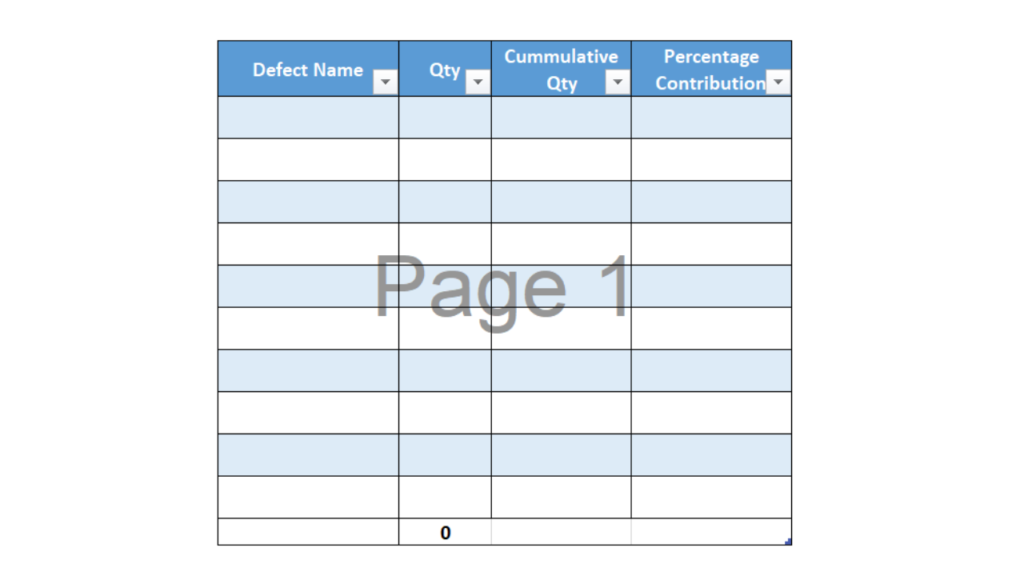
Step #2 : Populate Basic data
Populate data for variables, defect in this case, to be prioritized and their quantity.
Step #3 : Sort Quantity Column Largest to Smallest
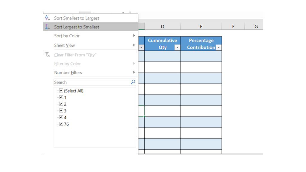
Step 3 for Pareto Chart formation
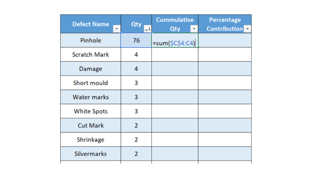
Step #4 : Add Formula for Cumulative Quantity
Add Formula for adding cumulative Quantity. In this specific example, it is =sum($C$4:C4)
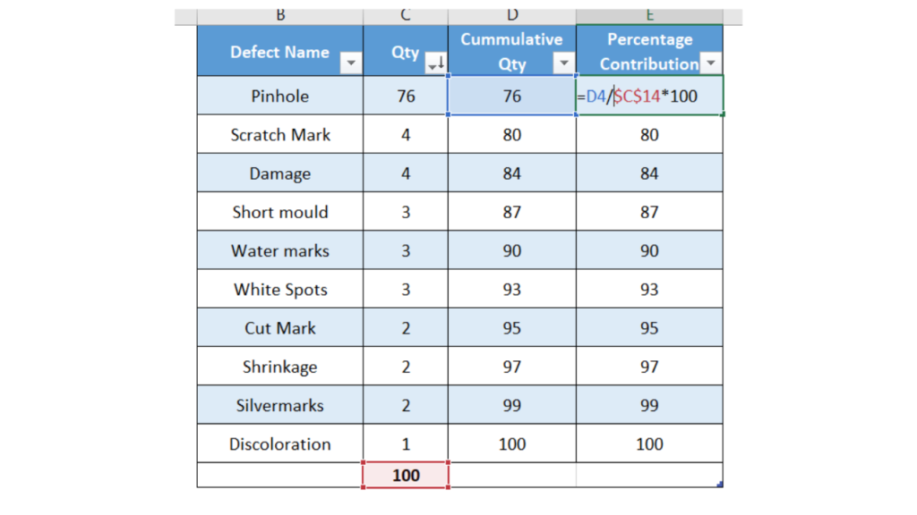
Step #5 : Calculate Percentage Contribution to Cumulative Quantity
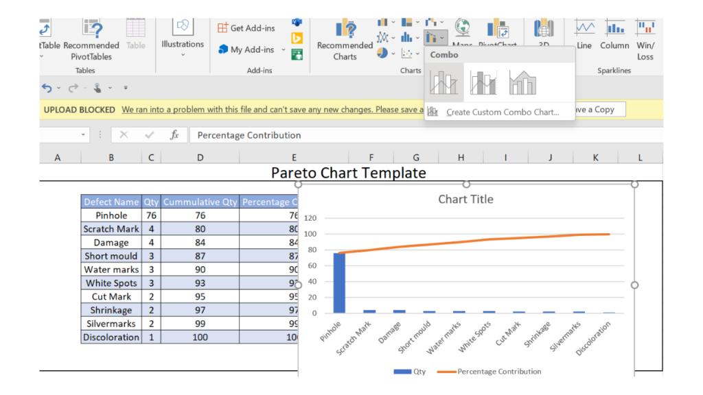
Step #6 : Insert Pareto Chart
Select Defect, Qty, and Percentage Contribution column and Click insert tab. In the insert, tab the go-to combo chart option and choose that option as depicted in the image below.
Step #7 : Add Secondary Axis for line chart
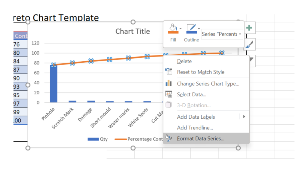
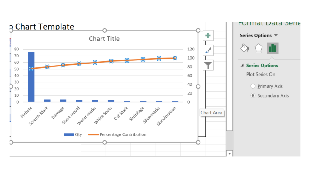
Step #8 : Format Chart
Do the basic formating such as add labels, chart title, etc and we have our Pareto chart.
Differences between bar graph and Pareto Chart
A bar graph is a graph that uses bars to show comparisons between different data sets. A Pareto chart is a specific type of bar graph that follows the 80/20 rule. In a Pareto chart, the bars are ordered from highest to lowest. The 80/20 rule states that for many events, roughly 80% of the effects come from 20% of the causes.
Pareto charts are often used to find the most important factors in a given situation. For example, if you were trying to improve customer satisfaction at a store, you could use a Pareto chart to find the 20% of issues that are causing 80% of the problems. By addressing these issues, you would likely see a large improvement in customer satisfaction.
Bar graphs are not restricted to this 80/20 rule and can be used to show any comparison between data sets. Bar graphs can be helpful in identifying trends or patterns in data.
For example, a bar graph could be used to show the number of hours worked per week for a group of employees. This information could be used to identify patterns in employee productivity.
Pareto charts are a useful tool for finding the most important factors in a given situation. However, bar graphs can also be helpful in identifying trends or patterns in data. As such, they are both valuable tools that should be included in any data analyst’s toolkit.
Differences between Tornado Chart and Pareto Chart
A Pareto chart is used to find and focus on the most important factors affecting a process. The 80-20 rule states that 80% of the effects come from 20% of the causes. The Pareto principle can be used to improve processes by focusing on the most important factors first.
Tornado charts are used to find and focus on the most important input factors affecting a process. The tornado chart is similar to the Pareto chart, but it uses input factors instead of output factors.
Both charts are useful tools for Six Sigma practitioners. However, the Pareto chart is more commonly used because it is easier to understand and interpret.
What are the advantages and disadvantages of Pareto Chart?
Advantages
- One of the advantages of the Pareto chart is that it helps to identify the main cause of defects or problems. Defects are ranked in order of their severity.
- The Pareto chart helps to determine the cumulative impact of the defect. In other words, it helps to identify the overall impact of all the defects.
- Another advantage of the Pareto chart is that it is simple and easy to use. It helps to prioritize the defects, and it can be used to determine the corrective action for the highest priority defects.
- The Pareto principle or 80-20 rule states that 80% of the effects come from 20% of the causes. This principle can be applied to many areas of life, and it is particularly useful for problem-solving. The Pareto chart is based on this principle, and it can be used to identify the problems that have the biggest impact.
Disadvantages
- One of the main disadvantages of the Pareto chart is that it can be difficult to use for small data sets.
- In addition, a Pareto chart can be time-consuming to create and may not be accurate when used with small data sets.
- Finally, the Pareto chart is not always the best tool to use when trying to identify the root cause of a problem.
Real Life examples of Pareto Chart
Real-life examples of the Pareto charts can include analyzing the efficiency of a manufacturing process or sorting through customer complaints to identify the most common issues.
In both cases, the Pareto chart can be used to help find and isolate the most important problems. For example, if you are trying to improve a manufacturing process, the Pareto chart can help you focus on the most common problems that are causing the most waste.
Similarly, if you are trying to identify the root cause of customer complaints, the Pareto chart can help you identify the most common complaints and determine where to start your investigation.