
Table of Contents
What is a scatter plot or diagram?
A scatter diagram or scatter plot is a mathematical diagram that plots pairs of data on an X-Y graph in order to reveal the relationship between the data sets. In other words, scatter diagrams help us understand how one set of data affects another.
They are commonly used in scientific and statistical analysis, as well as in business and marketing to visualize the relationships between different factors.
For example, scatter diagrams can be used to study the correlation between two variables – such as price and demand – or to investigate how a change in one variable affects the other.
There are many different types of scatter plots, but all share the same basic features: an X-axis (horizontal) and a Y-axis (vertical), as well as a series of points that represent the data. The type of scatter plot will vary depending on what information you want to glean from the data.
Scatter Diagram is one of the 7 QC tools. Following are the other 7 QC Tools
- Checksheet
- Pareto Chart
- Historgram
- Cause and Effect Diagram
- Stratification
- Control Charts
Understand Scatter Plot or Diagram
To give you a better understanding, let’s take a look at an example.
In this scatter diagram, we are looking at the relationship between two variables: height and weight. As you can see, there is a strong positive correlation between the two sets of data: as height increases, weight also tends to increase. This makes sense intuitively – taller people tend to be heavier than shorter people.
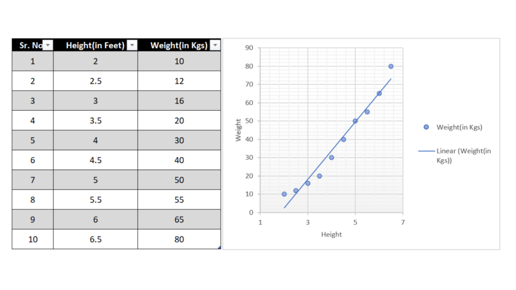
However, not all scatter diagrams are so straightforward. Sometimes it can be more difficult to spot relationships in the data set. In these cases, it can be helpful to add a trendline to the scatter plot. A trendline is a line that shows the overall direction of the data. In our example, the trendline would confirm that there is indeed a positive correlation between height and weight.
When to use a scatter diagram?
There are a few conditions in which we use a scatter diagram. Those conditions are as follows:
- We have a paired numerical data.In which one parameter is dependent and the other one is independent.
- Dependent variable has multiple values for each independent variable.
- If our objective is to determine whether two variables are related or not.Such cases include
- To identify the potential root causes of a problem.
- To determine objectively whether a cause and effect are related or not.
- To test autocorrelation before constructing a control chart.
How to do data collection for scatter Diagrams?
In order to collect data for a scatter diagram, you need to first determine what the X and Y variables are. The X variable is the independent variable, while the Y variable is the dependent variable.
Once you have determined the X and Y variables, you need to collect data points for each of them. Make sure to collect data points that represent different values for both the X and Y variables.
Once you have collected your data, you can plot it on a scatter diagram in order to see the relationship between the two variables.
How to Create a Scatter Diagram?
In order to create a scatter diagram, you need to have two sets of data that you want to compare. The first set of data is the independent variable, while the second set of data is the dependent variable. The independent variable is plotted on the X-axis, while the dependent variable is plotted on the Y-axis. After you have your data, you can then begin to plot it on a scatter diagram.
When creating a scatter diagram, there are a few things that you need to keep in mind:
- Make sure that your data points represent different values for both variables.
- Do not connect the data points with lines.
- Make sure that your scatter diagram is easy to interpret.
- Do not create a scatter diagram if you do not have enough data.
How to Interpret Scatter Diagram?
Once you have created your scatter diagram, you can then begin to analyze it. There are a few things that you can look for when analyzing a scatter diagram:
- Look for outliers in the data. Outliers are data points that do not fit the pattern of the rest of the data.
- Look for clusters in the data. Clusters are groups of data points that are close together.
- Look for trends in the data. Trends are patterns in the data that show how the variables are related to each other.
- Look for the direction of the relationship between the two variables. The direction can be positive or negative.
After you have analyzed your scatter diagram, you should be able to answer the following questions:
- What is the relationship between the two variables?
- Is the relationship positive or negative?
- What is the strength of the relationship?
Examples of Scatter Diagram
Scatter diagrams are used in many different fields, such as marketing (to study customer behavior), medicine (to study the effects of drugs on patients), engineering (to study how parts interact with each other), and physics (to study the behavior of particles).
An example of a positive correlation could be height vs weight. As the height of human beings increases so does the weight. The same is depicted in the scatter diagram below.
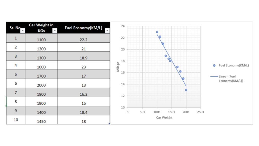
An example of a negative correlation would be the relationship between car weight and car mileage. As the car weight increases the mileage decreases.
One of the most famous scatter diagrams is the scatter diagram of Charles Darwin’s data on the beaks of finches. This scatter diagram helped him to develop his theory of evolution by natural selection.
Another example of a scatter diagram is the scatter diagram created by Wilfred Funk and Raymond Hill in order to study consumer behavior. This scatter diagram was used to study how people spend their money.
Scatter diagrams are also used in medicine to study the effects of drugs on patients. For example, a scatter diagram can be used to study the effect of a new drug on a group of patients taking age as the independent variable.
Scatter diagrams are also used in engineering to study how parts interact with each other. For example, a scatter diagram can be used to study how a new part affects the performance of an engine.
Scatter diagrams are very versatile tools that can be used in many different fields. If you take the time to learn how to use scatter diagrams, you will be able to use them to study a wide variety of topics.
How to use scatter diagram in Quality Control?
A scatter diagram is a graphical tool used to analyze relationships between two variables. It plots points on a graph, with the x-axis representing one variable and the y-axis representing the other.
The scatter plot can help you determine whether there is a correlation between the two variables and, if so, what that correlation might be.
When using a scatter diagram to analyze your data, it’s important to keep the following in mind:
- The data should be plotted in pairs.
- The points should be evenly spaced.
- The data should be plotted on a linear scale (i.e., no logarithmic scales).
- The axes should be labeled and include units of measurement.
Once you have plotted your data, there are a few things you can look for in the scatter plot:
- The direction of the line. A positive slope indicates that as x increases, y also increases. A negative slope indicates that as x increases, y decreases.
- The strength of the line. The closer the points are to being on a straight line, the stronger the correlation between x and y is. If the points are scattered all over the graph, there is no correlation between x and y.
- The point at which the line crosses zero. This is called the intercept and can be used to calculate a mathematical relationship between x and y.
By analyzing scatter plots, quality engineers can identify relationships between variables and use that information to improve quality control. Scatter plots are a valuable tool that every quality engineer should be familiar with.
Scatter Diagram | Advantages and Disadvantages
Advantages of a Scatter Diagram
There are several advantages of scatter diagrams:
- They allow you to visualize the relationship between two variables.
- They can help you identify outliers in your data.
- They can help you identify patterns in your data.
- They can help you understand how the variables are related to each other.
- They can help you determine the direction of the relationship between the two variables.
Disadvantages of a Scatter Diagram
There are also a few disadvantages of scatter diagrams:
- They can be time-consuming to create.
- They can be sometimes difficult to interpret.
- They can be misleading if the data is not accurate.
- They can be difficult to create if there are a lot of data points.
Despite the disadvantages, scatter diagrams can be a helpful tool for analyzing your data. If you take the time to create accurate scatter diagrams, they can help you understand the relationship between two variables and identify patterns in your data.
How to Make Scatter Diagram in Excel?
You can easily make a scatter diagram in excel and use it for multiple purposes.
Click Here: Make scatter plot in Excel
I hope this article has helped you to understand what scatter diagrams are and how they can be used to analyze data. If you have any questions, please feel free to leave a comment below. Thanks for reading!
References :