
Table of Contents
Definition
A histogram is a graphical tool used for representing data as frequency distribution.
It groups data into continuous number ranges and each range corresponds to a vertical bar i.e. the height of each bar shows how many cases fall into each range.
Each bar indicates the number of observations that lie in-between the range of values, known as class or bin.
A histogram is a two-axis chart. Its Y-Axis displays the frequency and the X-Axis displays the number range. One of the distinguishing features of Histogram is that there are no gaps between the range bars.
The histogram is one of the 7 QC tools. Following are the other 7 QC Tools
- Checksheet
- Pareto Chart
- Scatter Diagram
- Cause and Effect Diagram
- Stratification
- Control Charts
What do different shapes of Histograms tell us?
The histogram can be classified into different types based on the shape of the frequency distribution of the data. We can categorize histograms into 5 types based on their shapes. They are listed below:
- Bell Shaped Histogram
- Skewed Right Histogram
- Skewed Left Histogram
- Uniform Histogram
- Bimodal Histogram
- Multimodal Histogram
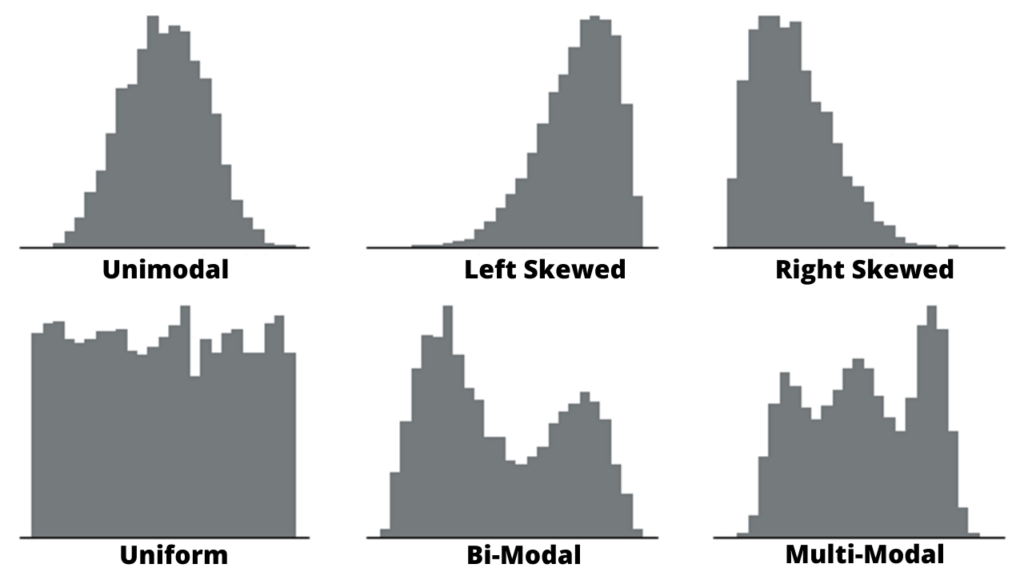
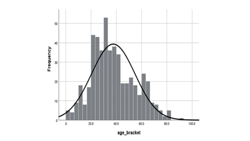
Bell Shaped Histogram
A bell-shaped histogram is Uni-mode in nature i.e. it has only one peak. The shape of the graph is such that the peak is at the centre of the graph and has a tapering downwards to the left and right side of the centre.
If the histogram is bell-shaped it signifies that its data has distribution around the centre and the frequency keeps on decreasing as we move towards left or right.
Skewed Right Histogram
A Skewed right histogram is Histogram skewed towards the right side. This type of histogram has a shape such that bars are skewed to the right i.e. tapering downwards to the right.
If the histogram is Skewed right it signifies that it has a linear trend of frequency decreasing as we move to the right.
Skewed Left Histogram
A Skewed Left histogram is a Histogram skewed towards the left side. This type of histogram has a shape such that bars are skewed to the Left i.e. tapering downwards to the left.
If the histogram is Skewed left it signifies that it has a linear trend of frequency decreasing as we move to the left.
Uniform Histogram
A Uniform histogram is one in which the height of all bars of the graph is almost the same. This type of Histogram looks similar to the side view of a rectangular box kept on a table.
If the histogram is Uniform Histogram it signifies that frequency remains more or less the same across the x-axis.
Bimodal Histogram
A Bi-model Histogram has two peaks or modes.
If the histogram is Bimodal Histogram it signifies that the data has a maximum frequency at two different intervals.
Multimodal Histogram
A Multimodal Histogram has multiple peaks or modes.
How to Choose the Correct Bin width for Histogram?
Choosing a correct bin size is an important step and shall not be ignored. However, there is no one correct way to select bin size. There are multiple ways to select bin size, here we will discuss a few amongst those.
Some thumb rules we can follow while choosing bin size are as follows.
- Choose Bin Size to be the whole number.
- Number of bins shall not be too little or too much.It should generally lie between 5 to 20.
- Bins shall include all data points and every effort shall be made to keep the bin width same throughout.
Square-Root Method
#Step 1: Find the maximum and minimum data point in the data set. Subtract the minimum from the maximum data point to find the total range. If the total range is not a whole number, round off it to the nearest integer.
#Step 2: Square root the total number of data points. Round off it to the nearest integer value. We get the ideal number of bins from here.
#Step 3: Divide the total range with the value obtained in step 2. If it’s not a whole number round off it to the nearest integer value. The value we get here is the ideal size or width of the bin.
Sturge’s Rule
Sturge’s rule is another way to choose bin sizes. The formula is:
K = 1 + 3. 322 logN
where:
K = Number of class intervals (bins).
N = Number of observations in the data set.
log = Logarithm of the number(N).
Sturge’s rule shall be used for continuous data that follows normal distribution laws.
There are other alternate formulas that are used for calculating bin size.But they are not used very often.
- Doane’s Rule
- Scott’s Rule
- Rice’s Rule
- Freedman and Diaconis (1981) rule
Doane’s rule to Choose Bin Sizes
Formula is as
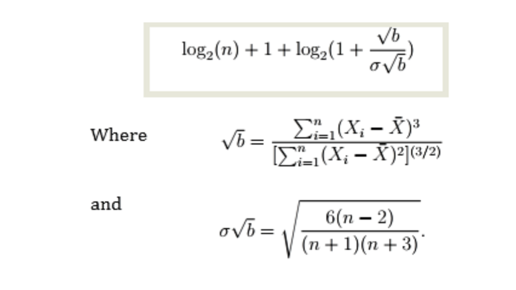
Doane’s formula (Legg et. al. 2013)
Scott’s Rule
Scott’s rule to choose bin sizes is based on the standard deviation(σ) of the data set. And the formula is:
3.49σn−1/3
Rice’s Rule
The formula for Rice’s rule is as follows:
(cube root of the total number of data points) * 2.
For 125 observations, the Rice rule equals 10 (the cubed root of 125 is 5; 5 * 2 = 10).
Freedman-Diaconis’s Rule
This formula uses the interquartile range (IQR):
2(IQR)n−1/3
How to make a Histogram in Excel?
#Step 1
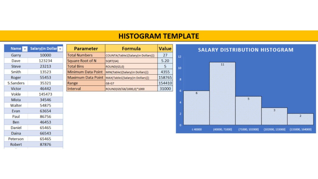
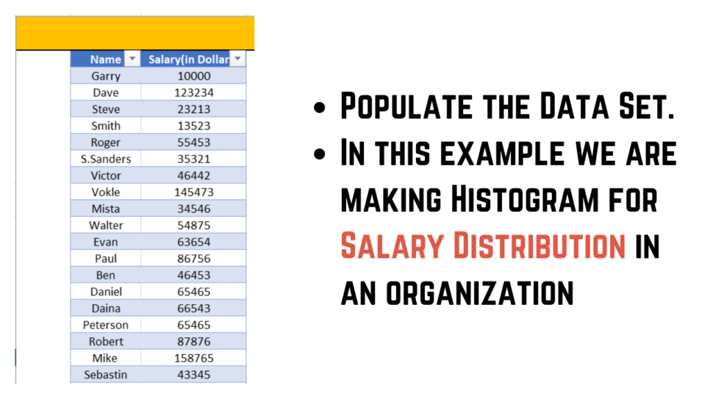
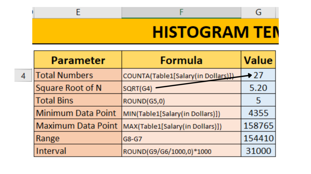
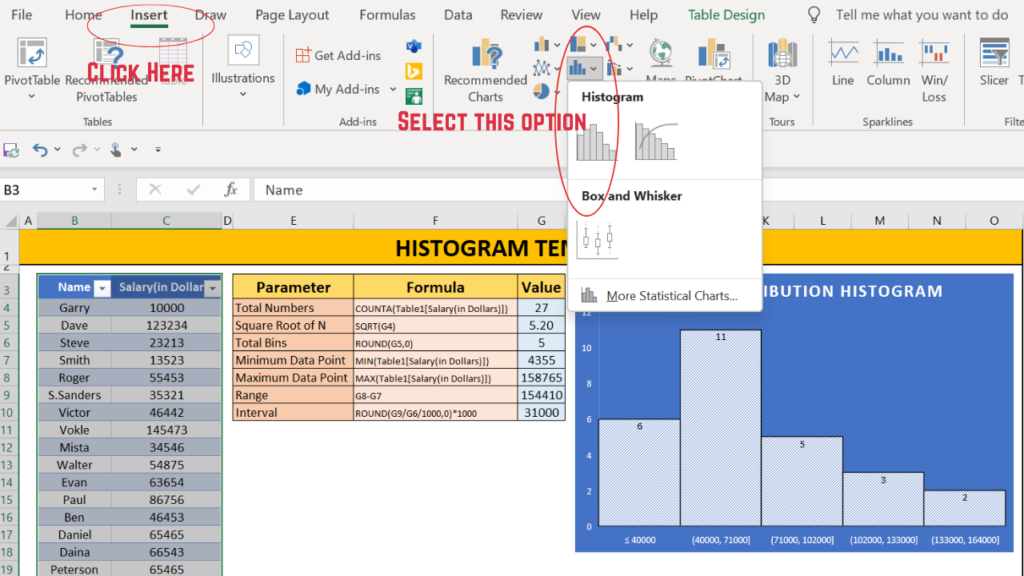
Populate the data set.For this example we have taken the data of salary distribution in an organisation.
#Step 2
Calculate the Bin or Interval width as shown in image below.
#Step 3
Insert Histogram chart as guided in the image below.
#Step 4
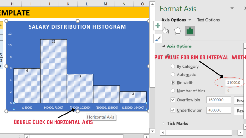
Modify the bin size as guided in the image below.
What are the Pros and Cons of Histogram?
Like each coin has two sides, Histogram has some pros as well as some cons. Following are some of the pros and cons associated with histograms.
Pros
- Helps visualize the data distribution pattern and conclusions can be drawn by just looking at the shape of the histogram.
- Provides a clear idea about the frequency and hence predicts probabilistic chances of any event occurring.
- Helps display a large set of data in a compressed manner.
Cons
- The histogram doesn’t show information about what is happening within each bin of the graph.
- It shows the number of values within an interval but not the actual values i.e. we cannot read exact values because data is grouped into categories.
- With Histogram it’s difficult to compare two data sets.
- Histogram use only with continuous data.
What is the Difference between Histogram and Bar Graph?
Bar graphs and Histogram look similar to each other but there exist significant points of differentiation between the two. Following are the points of differentiation.
- A histogram represents the frequency distribution of continuous variables.Whereas a bar graph is a categorical comparison of discrete variables.
- A histogram is a pictorial representation of a data set to show frequency distribution of that data set.A Bar graph is a pictorial representation of a data set in such a manner that it can be used for comparing different categories.
- A histogram does not have a gap between its bars but a bar graph does have a gap between its bars.
- In the case of Histogram sequence of blocks or bars cannot be altered but in case of bar graphs it can be altered.
- The width of each bar is same incase of bar graph but in case of histogram the width of bar may or may not be same.
- Histogram presents numerical data whereas bar graph presents categorical data.Or we can say that Histogram is used for distribution of non-discrete variables while Bar Graph is used for comparison of discrete variables .
Where do we use Histograms in Real life?
A histogram is often used to illustrate the major features of the distribution of the data in a convenient form. It is also useful when dealing with large data sets (greater than 100 observations).
It can also help detect any unusual observations or any gaps in the data.
Here I have covered two examples of histogram usage in real life.
Example 1 : Distribution of Covid19 cases w.r.t Age of the person.
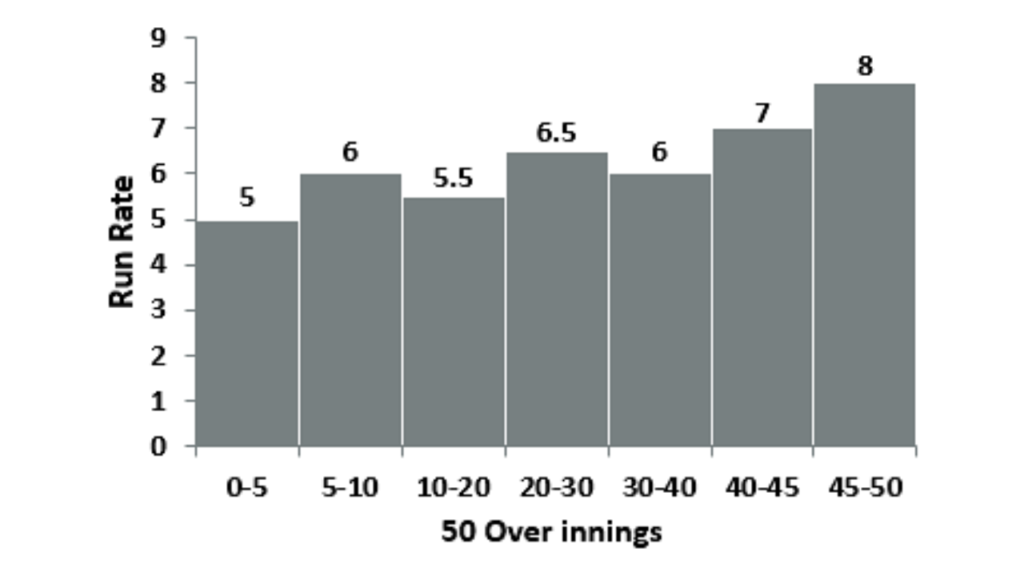
Example 2 : Distribution of Run Rate over 50 overs inning.
Templates of Histogram
References
Photo Credits: www.Freepik.com