As a quality engineer, you know that using the right tools is critical to success. In this article, we’ll discuss seven of the most important quality control tools i.e. 7 QC Tools, and how they can help your business.
We’ll also explore some of the benefits of each tool and how to use them effectively.
By understanding these tools and incorporating them into your quality control process, you can ensure that your products are consistently high-quality.
Let’s get started!
Table of Contents
Origin of 7 QC Tools
The 7QC tools are said to have been developed by Kaoru Ishikawa in postwar Japan, inspired by Benkei’s seven famous weapons.
Benkei was a Japanese warrior monk who armed himself with seven weapons and was on a personal quest to take 1,000 swords from samurai warriors who he considered arrogant and undeserving.
In 1950, Dr. W. Edwards Deming gave a series of lectures to a group of Japanese scientists and engineers in which he made his first public appearance outside the United States.
Unfortunately, most people were intimidated by the subject’s complexity, so Ishikawa concentrated on only a few tools that would suffice for most quality-related concerns.
7 QC Tools
#1 Checksheet
Checksheet is a data collection tool. It is an analytical tool used to collect, record, and present data for the objective of conducting analysis.
Checksheet is used to collect both quantitative and qualitative data.
When a Check-sheet is used for collecting Quantitative data it is generally called a Tally Sheet.
Data Collection is the primary step for any improvement identification or problem analysis.
Types of the checksheets are majorly based on the type and purpose of data collected.
Following are the types of checksheets:
- Classification Checksheet
- Defect Location CheckSheet
- Frequency Checksheet
- Measurement Scale Checksheet

To read about Checksheets in more detail, check our article on Checksheet.
What is Checksheet? | Free Template
#2 Histogram
A histogram is a graphical tool used for representing data as frequency distribution.
It groups data into continuous number ranges and each range corresponds to a vertical bar i.e. the height of each bar shows how many cases fall into each range.
Each bar indicates the number of observations that lie in-between the range of values, known as class or bin.
A histogram is a two-axis chart. Its Y-Axis displays the frequency and the X-Axis displays the number range. One of the distinguishing features of a Histogram is that there are no gaps between the range bars.
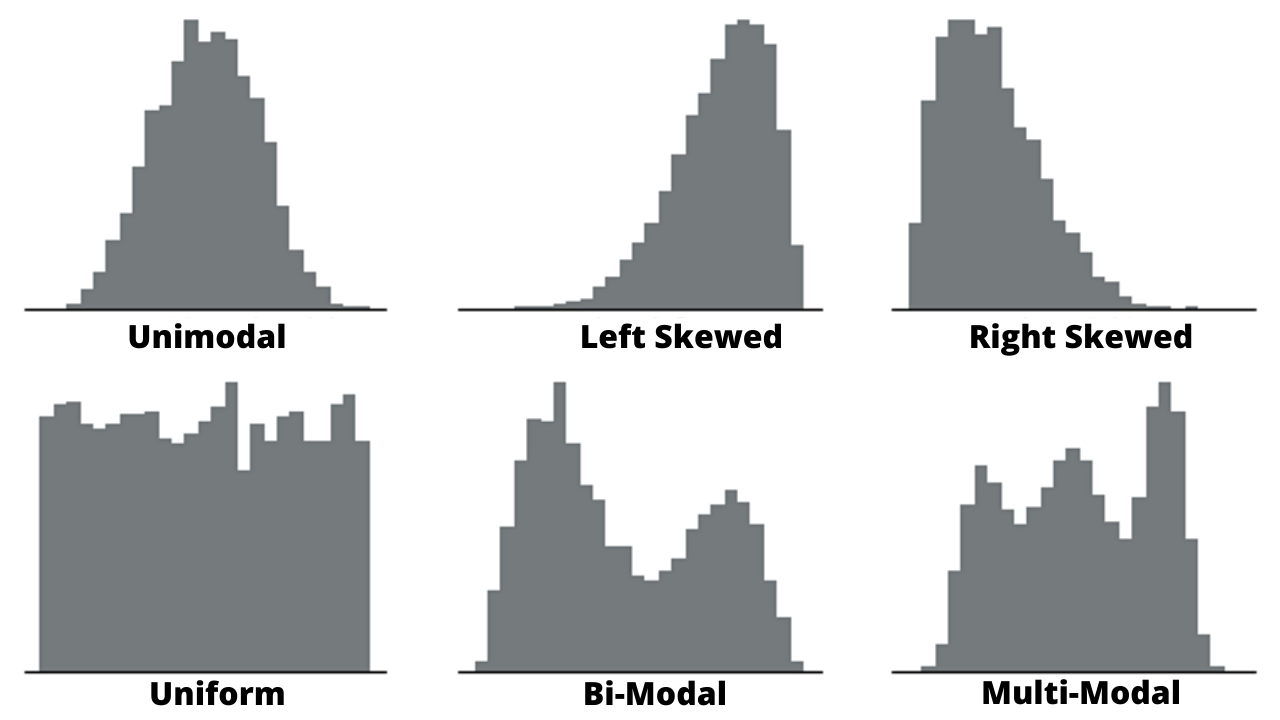
The histogram can be classified into different types based on the shape of the frequency distribution of the data. We can categorize histograms into 5 types based on their shapes. They are listed below:
- Bell Shaped Histogram
- Skewed Right Histogram
- Skewed Left Histogram
- Uniform Histogram
- Bimodal Histogram
- Multimodal Histogram
To read about Histogram in more detail, check our article on Histogram.
#3 Scatter Diagram
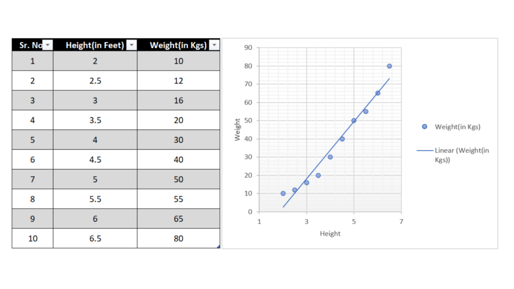
A scatter diagram or scatter plot is a mathematical diagram that plots pairs of data on an X-Y graph in order to reveal the relationship between the data sets.
In other words, scatter diagrams help us understand how one set of data affects another.
They are commonly used in scientific and statistical analysis, as well as in business and marketing to visualize the relationships between different factors.
For example, scatter diagrams can be used to study the correlation between two variables – such as price and demand – or to investigate how a change in one variable affects the other.
There are many different types of scatter plots, but all share the same basic features: an X-axis (horizontal) and a Y-axis (vertical), as well as a series of points that represent the data. The type of scatter plot will vary depending on what information you want to glean from the data.
There are several advantages of scatter diagrams:
- They allow you to visualize the relationship between two variables.
- They can help you identify outliers in your data.
- They can help you identify patterns in your data.
- They can help you understand how the variables are related to each other.
- They can help you determine the direction of the relationship between the two variables.
To read about scatter diagrams in more detail, check our article on Histogram.
#4 Fishbone Diagram
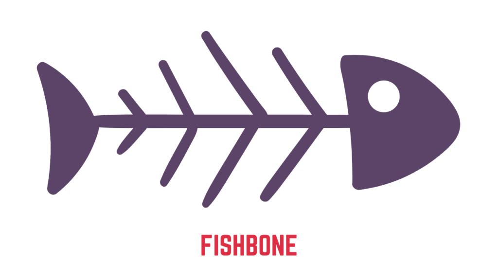
A Fishbone diagram is a graphical tool used for organizing potential causes of a problem in a logical manner. The fishbone diagram identifies many possible causes for an effect or problem.
It can be used to structure a brainstorming session. It immediately sorts ideas into useful categories. It is mostly used in conjunction with other problem-solving techniques, such as 5 Why root cause analysis.
It is called a fishbone diagram because of its shape. Its shape looks like a fishbone and hence the name fishbone diagram.
There are a number of advantages to using fishbone diagrams:
- They help to identify the root causes of problems.
- They are an effective way of organizing and visualizing data.
- They can be used to generate hypotheses about problems.
- Help prioritize relevant causes, so underlying root causes are addressed first.
To read about Fishbone Diagram in more detail, check our article on the Fishbone diagram.
#5 Pareto Charts
A Pareto chart is a graphical tool used to display the relative proportions of occurrence of different values. It is named after economist Vilfredo Pareto, who observed that 80% of Italy’s land was owned by 20% of its population.
The Pareto principle, also known as the 80/20 rule, has been popularized in business and quality management as a way to focus on those activities that will yield the most results. The theory behind the principle is that a relatively small number of causes (the vital few) produce the majority of effects (the trivial many).
In other words, you can achieve a lot with a little effort if you focus on the right things. When applied to quality improvement, the Pareto principle can help you prioritize actions and allocate resources to achieve the greatest impact.
The bars are arranged with the longest on the left and the shortest on the right so they visually depict what percentage occurs more often than others. A Pareto chart can be used to find what factors are more important so that you can focus on them.
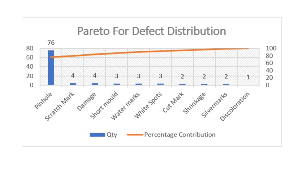
Pareto Charts offer multiple benefits :
- One of the advantages of the Pareto chart is that it helps to identify the main cause of defects or problems. Defects are ranked in order of their severity.
- The Pareto chart helps to determine the cumulative impact of the defect. In other words, it helps to identify the overall impact of all the defects.
- Another advantage of the Pareto chart is that it is simple and easy to use. It helps to prioritize the defects, and it can be used to determine the corrective action for the highest priority defects.
- The Pareto principle or 80-20 rule states that 80% of the effects come from 20% of the causes. This principle can be applied to many areas of life, and it is particularly useful for problem-solving. The Pareto chart is based on this principle, and it can be used to identify the problems that have the biggest impact.
To read about Pareto Charts in more detail, check our article on Pareto Charts.
#6 Stratification
Stratification is a quality control tool for sorting data, things, and people into separate and distinct categories. Stratifying your data can help you figure out what it means, revealing patterns that might otherwise be undetectable when it’s grouped together.
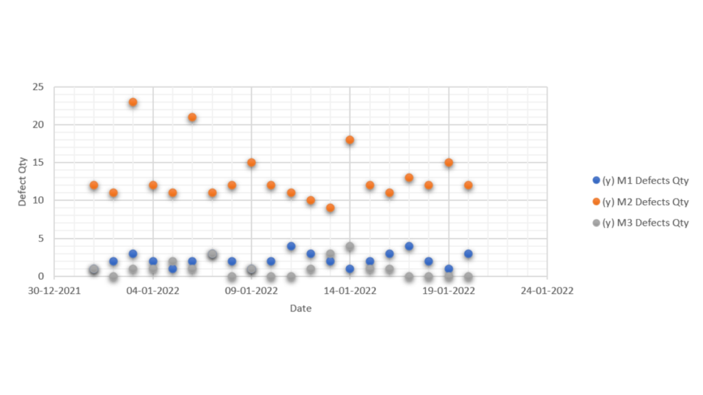
To read about stratification in more detail, check our article on Stratification.
#7 Control Charts
Control Charts are graphical tools used to monitor and control a process. There are different types of Control Charts, but all aim to help identify and correct process problems.
Control charts can be used in many industries, such as healthcare, manufacturing, and as part of various methodologies such as TQM, Six Sigma, Kanban, and project management.
Control charts are used to study how a process changes over time and to identify when and how the process goes out of control. Control charts can help you to improve the quality of your product or service and to ensure that your process is running smoothly.
There are many benefits to using control charts, including:
- they help to identify problems in a process
- they help to determine the cause of the problem
- they help to find the appropriate corrective action
- they help to track the progress of the corrective action
- They help to prevent future problems.
To read about Control Charts in more detail, check our article on Control Charts.
How to use 7 QC Tools?
Each of the 7 QC Tools provides its own unique benefits that can help improve the quality of products. Here is a description of how each tool can be used:
– Control Chart: The Control Chart can be used to track and measure the variability of a process.
The Control Chart can help operators identify and track special causes of variation, which can help improve the quality of products.
– Pareto Chart: The Pareto Chart can be used to identify and prioritize the most important causes of defects. The Pareto Chart can help operators focus on the most important problems and improve the quality of products.
– Histogram: The Histogram can be used to track and measure the distribution of data. The Histogram can help operators identify and track special causes of variation, which can help improve the quality of products.
– Scatter Diagram: The Scatter Diagram can be used to identify and track the relationship between two variables. The Scatter Diagram can help operators identify and track special causes of variation, which can help improve the quality of products.
– Check Sheet: The Check Sheet can be used to track and measure the characteristics of a process.
– Flowchart: The Flowchart can be used to map and understand the flow of a process.
– Cause and Effect Diagram: The Cause and Effect Diagram can be used to identify and track the relationships between causes and effects.
New 7 QC Tools
In 1976, the Union of Japanese Scientists and Engineers (JUSE) saw the need for tools to promote innovation, communicate information, and successfully plan major projects.
A team researched and developed the seven new quality control tools, to be used along with the 7 basic quality tools.
Often called the seven management and planning (MP) tools, or simply the seven management tools.
The seven new tools, listed in an order that moves from abstract analysis to detailed planning, are:
- Affinity Diagram
- Relations Diagram
- Tree Diagram
- Matrix Diagram
- Arrows Diagram
- Process Decision Program Chart
- Prioritization Matrix- Matrix Data Analysis
Affinity Diagram
An affinity diagram is a tool that is used for organizing and sorting data. It is used to identify the similarities and differences between a group of items.
The affinity diagram is also known as the KJ Method, named after Japanese quality control experts Jiro Kawakita and Kaoru Johansson.
The method was developed in the early 1960s. The affinity diagram is used to identify the cause-and-effect relationships between different items.
Relationship Diagram
A relationship diagram is a tool that is used to identify the relationships between different items.
It is also known as the Ishikawa diagram, named after quality control expert Kaoru Ishikawa. The diagram was developed in the early 1960s.
It helps Find Solutions by Clarifying Relationships with Complex Interrelated Causes. To allow a team to systematically identify, analyze, and classify the cause and effect relationships that exist among all critical issues.
- Useful at the planning stage for obtaining perspective on the overall situation.
- Facilitates consensus among team
- Assists to develop and change people’s thinking
- Enables priorities to be identified accurately
Tree Diagrams
A tree diagram is a graphical tool used to represent the hierarchical relationships between items in a data set.
Also known as a “decision tree,” a tree diagram can be used to evaluate various scenarios and determine the optimal course of action.
Tree diagrams are commonly used in project management, business decision-making, risk assessment, and event planning.
Matrix Diagram
Matrix diagrams are used to help identify and understand the relationships between elements of a system.
In quality control, matrix diagrams can be used to identify and understand the relationships between various quality characteristics and the causes that affect them.
Matrix diagrams are used to help identify and understand the relationships between elements of a system.
Consists of a two-dimensional array to determine the location and nature of the problem Discovers key ideas by relationships represented by the cells in the matrix.
- It helps incorporate data while working on different ideas based on extensive experience
- Clarifies relationships among different elements
- Makes the overall structure of the problem immediately obvious
- Combined with two to four types of diagrams, the location of the problem is clearer.
Arrow Diagram
Arrow Diagram is used for Working Out Optimal Schedules and Controlling Them Effectively.
- The arrow diagram shows relationships among tasks needed to implement a plan.
- Allows overall tasks to be viewed and potential snags to be identified before work starts. This leads to discovery of possible improvements
- Makes it easy to monitor the progress of work
- Deals promptly with changes to the plan
- Improves communication among team
Process Decisions Program Charts (PDPC)
PDPCs are used for planning the activities needed to solve problems when information is incomplete or the situation is fluid and hard to forecast.
Examples include planning an R & D project, mapping out countermeasures against long-term chronic problems, and planning a sales campaign.
A PDPC consists of a series of steps linked in sequence. Its goal is to depict the events and contingencies likely to occur when progressing from a starting point to one or more final outcomes
Prioritization Matrix
This technique quantifies, arranges data, and presents it in Matrix form.
It involves finding indicators that differentiate and attempt to clarify a large amount of information.
Prioritization Matrix is used by teams to narrow down options through a systematic approach of comparing choices by selecting, weighting, and applying criteria.
Benefits of 7 QC Tools
The 7 QC Tools have been shown to provide a number of benefits, including:
- Improved product quality
- Increased efficiency
- Reduced manufacturing costs
- Reduced waste and scrap
- Improved customer satisfaction
- Improved safety and health
Each of the 7 QC Tools provides its own unique benefits that can help improve the quality of products.
Hope this article was helpful. If yes do comment and share with your peers.
Keep improving!


